What You Should Already Know
Before you continue you should have a basic understanding of the following:- HTML
CSS Demo - One Page - Multiple Styles!
One HTML page displayed with different style sheets.What is CSS?
- CSS stands for Cascading Style Sheets
- CSS defines how HTML elements are to be displayed
- Styles were added to HTML 4.0 to solve a problem
- CSS saves a lot of work
- External Style Sheets are stored in CSS files
CSS Solved a Big Problem
HTML was NEVER intended to contain tags for formatting a document.HTML was intended to define the content of a document, like:
<h1>This is a heading</h1>
<p>This is a paragraph.</p>
When tags like <font>, and color attributes were added to the HTML 3.2 specification, it started a nightmare for web developers. Development of large web sites, where fonts and color information were added to every single page, became a long and expensive process.
To solve this problem, the World Wide Web Consortium (W3C) created CSS.
In HTML 4.0, all formatting could (and should!) be removed from the HTML document, and stored in a separate CSS file.
CSS Saves a Lot of Work!
The style definitions are normally saved in external .css files.With an external style sheet file, you can change the look of an entire Web site by changing just one file!
CSS Syntax
A CSS rule set consists of a selector and a declaration block: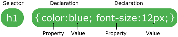
The selector points to the HTML element you want to style.
The declaration block contains one or more declarations separated by semicolons.
Each declaration includes a property name and a value, separated by a colon.
CSS Example
A CSS declaration always ends with a semicolon, and declaration groups are surrounded by curly braces:
p {color:red;text-align:center;}
In the following example all <p> elements will be center-aligned, with a red text color:
Example
p
{
color: red;
text-align: center;
}
color: red;
text-align: center;
}
CSS Comments
Comments are used to explain your code, and may help you when you edit the source code at a later date. Comments are ignored by browsers.A CSS comment starts with /* and ends with */. Comments can also span multiple lines:
Example
p
{
color: red;
/* This is a single-line comment */
text-align: center;
}
/* This is
a multi-line
comment */
color: red;
/* This is a single-line comment */
text-align: center;
}
/* This is
a multi-line
comment */
CSS Selectors
CSS selectors allow you to select and manipulate HTML elements.CSS selectors are used to "find" (or select) HTML elements based on their id, class, type, attribute, and more.
The element Selector
The element selector selects elements based on the element name.You can select all <p> elements on a page like this: (all <p> elements will be center-aligned, with a red text color)
The id Selector
The id selector uses the id attribute of an HTML element to select a specific element.An id should be unique within a page, so the id selector is used if you want to select a single, unique element.
To select an element with a specific id, write a hash character, followed by the id of the element.
The style rule below will be applied to the HTML element with id="para1":
Example
#para1
{
text-align: center;
color: red;
}
text-align: center;
color: red;
}
 |
Do NOT start an ID name with a number! |
|---|
The class Selector
The class selector selects elements with a specific class attribute.To select elements with a specific class, write a period character, followed by the name of the class:
In the example below, all HTML elements with class="center" will be center-aligned:
You can also specify that only specific HTML elements should be affected by a class.
In the example below, all <p> elements with class="center" will be center-aligned:
Example
p.center {
text-align: center;
color: red;
}
text-align: center;
color: red;
}
|
Do NOT start a class name with a number! |
|---|
Grouping Selectors
If you have elements with the same style definitions, like this:
h1
{
text-align: center;
color: red;
}
h2 {
text-align: center;
color: red;
}
p {
text-align: center;
color: red;
}
text-align: center;
color: red;
}
h2 {
text-align: center;
color: red;
}
p {
text-align: center;
color: red;
}
To group selectors, separate each selector with a comma.
In the example below we have grouped the selectors from the code above:
Example
h1, h2, p
{
text-align: center;
color: red;
}
text-align: center;
color: red;
}
CSS How To...
When a browser reads a style sheet, it will format the document according to
the information in the style sheet.
Three Ways to Insert CSS
There are three ways of inserting a style sheet:- External style sheet
- Internal style sheet
- Inline style
External Style Sheet
An external style sheet is ideal when the style is applied to many pages. With an external style sheet, you can change the look of an entire Web site by changing just one file.Each page must include a link to the style sheet with the <link> tag. The <link> tag goes inside the head section:
<head>
<link rel="stylesheet" type="text/css" href="mystyle.css">
</head>
<link rel="stylesheet" type="text/css" href="mystyle.css">
</head>
body {
background-color: lightblue;
}
h1 {
color: navy;
margin-left: 20px;
}
background-color: lightblue;
}
h1 {
color: navy;
margin-left: 20px;
}
|
Do not add a space between the property value and the unit (such as margin-left: 20 px;). The correct way is: margin-left: 20px; |
|---|
Internal Style Sheet
An internal style sheet should be used when a single document has a unique style. You define internal styles in the head section of an HTML page, inside the <style> tag, like this:Example
<head>
<style>
body {
background-color: linen;
}
h1 {
color: maroon;
margin-left: 40px;
}
</style>
</head>
<style>
body {
background-color: linen;
}
h1 {
color: maroon;
margin-left: 40px;
}
</style>
</head>
Inline Styles
An inline style loses many of the advantages of a style sheet (by mixing content with presentation). Use this method sparingly!To use inline styles, add the style attribute to the relevant tag. The style attribute can contain any CSS property. The example shows how to change the color and the left margin of a h1 element:
Multiple Style Sheets
If some properties have been set for the same selector in different style sheets, the values will be inherited from the more specific style sheet.For example, assume that an external style sheet has the following properties for the <h1> element:
h1
{
color: navy;
margin-left: 20px;
}
color: navy;
margin-left: 20px;
}
h1
{
color: orange;
}
color: orange;
}
color: orange;
margin-left: 20px;
margin-left: 20px;
Multiple Styles Will Cascade into One
Styles can be specified:- inside an HTML element
- inside the <head> section of an HTML page
- in an external CSS file
Cascading order
What style will be used when there is more than one style specified for an HTML element?Generally speaking we can say that all the styles will "cascade" into a new "virtual" style sheet by the following rules, where number four has the highest priority:
- Browser default
- External style sheet
- Internal style sheet (in the head section)
- Inline style (inside an HTML element)
|
Note: If the link to the external style sheet is placed after the internal style sheet in HTML <head>, the external style sheet will override the internal style sheet! |
|---|
CSS3 Introduction
CSS3 has been split into "modules". It contains the "old CSS specification" (which has been split into smaller pieces). In addition, new modules are added.
Some of the most important CSS3 modules are:
- Selectors
- Box Model
- Backgrounds and Borders
- Image Values and Replaced Content
- Text Effects
- 2D/3D Transformations
- Animations
- Multiple Column Layout
- User Interface
CSS3 Recommendation
Most of the CSS3 Modules are W3C Recommendations, and CSS3 properties are implemented in all modern browsers.CSS3 Borders
CSS3 Borders
With CSS3, you can create rounded borders, add shadow to boxes, and use an image as aborder - without using a design program, like Photoshop.
In this chapter you will learn about the following border properties:
- border-radius
- box-shadow
- border-image
Browser Support
The numbers in the table specify the first browser version that fully supports the property.Numbers followed by -webkit-, -moz-, or -o- specify the first version that worked with a prefix.
| Property | |||||
|---|---|---|---|---|---|
| border-radius | 9.0 | 5.0 4.0 -webkit- |
4.0 3.0 -moz- |
5.0 3.1 -webkit- |
10.5 |
| box-shadow | 9.0 | 10.0 4.0 -webkit- |
4.0 3.5 -moz- |
5.1 3.1 -webkit- |
10.5 |
| border-image | 11.0 | 16.0 4.0 -webkit- |
15.0 3.5 -moz- |
6.0 3.1 -webkit- |
15.0 11.0 -o- |
CSS3 The border-radius Property - Rounded Corners
Adding rounded corners in CSS2 was tricky. We had to use different images for each corner.In CSS3, creating rounded corners is easy.
In CSS3, the border-radius property is used to create rounded corners:
This box has rounded corners!
Example
Add rounded corners to a <div> element:
div
{
border: 2px solid;
border-radius: 25px;
}
border: 2px solid;
border-radius: 25px;
}
CSS3 The box-shadow Property
In CSS3, the box-shadow property is used to add shadow to boxes:Example
Add a box-shadow to a <div> element:
div
{
box-shadow: 10px 10px 5px #888888;
}
box-shadow: 10px 10px 5px #888888;
}
CSS3 The border-image Property
With the CSS3 border-image property you can use an image to create a border:
The border-image property allows you to specify an image as a border!
The original image used to create the border above:
Example
Use an image to create a border around a <div> element:
div
{
-webkit-border-image: url(border.png) 30 30 round; /* Safari 3.1-5 */
-o-border-image: url(border.png) 30 30 round; /* Opera 11-12.1 */
border-image: url(border.png) 30 30 round;
}
-webkit-border-image: url(border.png) 30 30 round; /* Safari 3.1-5 */
-o-border-image: url(border.png) 30 30 round; /* Opera 11-12.1 */
border-image: url(border.png) 30 30 round;
}
CSS3 Border Properties
| Property | Description | CSS |
|---|---|---|
| border-image | A shorthand property for setting all the border-image-* properties | 3 |
| border-radius | A shorthand property for setting all the four border-*-radius properties | 3 |
| box-shadow | Attaches one or more drop-shadows to the box | 3 |
CSS3 Backgrounds
CSS3 Backgrounds
CSS3 contains several new background properties,which allow greater control of the background element.
In this chapter you will learn about the following background properties:
- background-size
- background-origin
Browser Support
The numbers in the table specify the first browser version that fully supports the property.Numbers followed by -webkit-, -moz-, or -o- specify the first version that worked with a prefix.
| Property | |||||
|---|---|---|---|---|---|
| background-size | 9.0 | 4.0 1.0 -webkit- |
4.0 3.6 -moz- |
4.1 3.0 -webkit- |
10.5 10.0 -o- |
| background-origin | 9.0 | 1.0 | 4.0 | 3.0 | 10.5 |
CSS3 The background-size Property
The background-size property specifies the size of the background image.Before CSS3, the background image size was determined by the actual size of the image. In CSS3 it is possible to specify the size of the background image, which allows us to re-use background images in different contexts.
You can specify the size in pixels or in percentages. If you specify the size as a percentage, the size is relative to the width and height of the parent element.
Example 1
Resize a background image:
div
{
background: url(img_flwr.gif);
background-size: 80px 60px;
background-repeat: no-repeat;
}
background: url(img_flwr.gif);
background-size: 80px 60px;
background-repeat: no-repeat;
}
Example 2
Stretch the background image to completely fill the content area:
div
{
background: url(img_flwr.gif);
background-size: 100% 100%;
background-repeat: no-repeat;
}
background: url(img_flwr.gif);
background-size: 100% 100%;
background-repeat: no-repeat;
}
CSS3 The background-origin Property
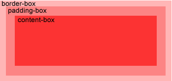
The background-origin property specifies the positioning area of the background images.The background image can be placed within the content-box, padding-box, or border-box area.
Example
Position the background image within the content-box:
div
{
background: url(img_flwr.gif);
background-repeat: no-repeat;
background-size: 100% 100%;
background-origin: content-box;
}
background: url(img_flwr.gif);
background-repeat: no-repeat;
background-size: 100% 100%;
background-origin: content-box;
}
CSS3 Multiple Background Images |
|
| CSS3 allows you to use several background images for an element. |
Example
Set two background images for the <body> element:
body {
background: url(img_tree.gif), url(img_flwr.gif);
background-size: 100% 100%;
background-repeat: no-repeat;
}
background: url(img_tree.gif), url(img_flwr.gif);
background-size: 100% 100%;
background-repeat: no-repeat;
}
CSS3 Background Properties
| Property | Description | CSS |
|---|---|---|
| background-clip | Specifies the painting area of the background images | 3 |
| background-origin | Specifies the positioning area of the background images | 3 |
| background-size | Specifies the size of the background images | 3 |
CSS3 Gradients

CSS3 gradients let you display smooth transitions between two or more specified colors.
Earlier, you had to use images for these effects. However, by using CSS3 gradients you can reduce download time and bandwidth usage. In addition, elements with gradients look better when zoomed, because the gradient is generated by the browser.
CSS3 defines two types of gradients:
- Linear Gradients (goes down/up/left/right/diagonally)
- Radial Gradients (defined by their center)
Browser Support
The numbers in the table specify the first browser version that fully supports the property.Numbers followed by -webkit-, -moz-, or -o- specify the first version that worked with a prefix.
| Property | |||||
|---|---|---|---|---|---|
| linear-gradient | 10.0 | 26.0 10.0 -webkit- |
16.0 3.6 -moz- |
6.1 5.1 -webkit- |
12.1 11.1 -o- |
| radial-gradient | 10.0 | 26.0 10.0 -webkit- |
16.0 3.6 -moz- |
6.1 5.1 -webkit- |
12.1 11.6 -o- |
| repeating-linear-gradient | 10.0 | 26.0 10.0 -webkit- |
16.0 3.6 -moz- |
6.1 5.1 -webkit- |
12.1 11.1 -o- |
| repeating-radial-gradient | 10.0 | 26.0 10.0 -webkit- |
16.0 3.6 -moz- |
6.1 5.1 -webkit- |
12.1 11.6 -o- |
CSS3 Linear Gradients
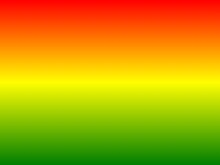
To create a linear gradient you must define at least two color stops. Color stops are the colors you want to render smooth transitions among. You can also set a starting point and a direction (or an angle) along with the gradient effect.Example of Linear Gradient:
Syntax
background: linear-gradient(direction, color-stop1,
color-stop2, ...);
The following example shows a linear gradient that starts at the top. It starts red, transitioning to blue:
Example
A linear gradient from top to bottom:
#grad {
background: -webkit-linear-gradient(red, blue); /* For Safari 5.1 to 6.0 */
background: -o-linear-gradient(red, blue); /* For Opera 11.1 to 12.0 */
background: -moz-linear-gradient(red, blue); /* For Firefox 3.6 to 15 */
background: linear-gradient(red, blue); /* Standard syntax */
}
background: -webkit-linear-gradient(red, blue); /* For Safari 5.1 to 6.0 */
background: -o-linear-gradient(red, blue); /* For Opera 11.1 to 12.0 */
background: -moz-linear-gradient(red, blue); /* For Firefox 3.6 to 15 */
background: linear-gradient(red, blue); /* Standard syntax */
}
The following example shows a linear gradient that starts from the left. It starts red, transitioning to blue:
Example
A linear gradient from left to right:
#grad {
background: -webkit-linear-gradient(left, red , blue); /* For Safari 5.1 to 6.0 */
background: -o-linear-gradient(right, red, blue); /* For Opera 11.1 to 12.0 */
background: -moz-linear-gradient(right, red, blue); /* For Firefox 3.6 to 15 */
background: linear-gradient(to right, red , blue); /* Standard syntax */
}
You can make a gradient diagonally by specifying both the horizontal and vertical starting positions.
The following example shows a linear gradient that starts at top left (and goes to bottom right). It starts red, transitioning to blue:
Example
A linear gradient that starts at top left (and goes to bottom right):
#grad {
background: -webkit-linear-gradient(left top, red , blue); /* For Safari 5.1 to 6.0 */
background: -o-linear-gradient(bottom right, red, blue); /* For Opera 11.1 to 12.0 */
background: -moz-linear-gradient(bottom right, red, blue); /* For Firefox 3.6 to 15 */
background: linear-gradient(to bottom right, red , blue); /* Standard syntax */
}
Using Angles
If you want more control over the direction of the gradient, you can define an angle, instead of the predefined directions (to bottom, to top, to right, to left, to bottom right, etc.).Syntax
background: linear-gradient(angle, color-stop1,
color-stop2);
The following example shows how to use angles on linear gradients:
Example
A linear gradient with a specified angle:
#grad {
background: -webkit-linear-gradient(180deg, red, blue); /* For Safari 5.1 to 6.0 */
background: -o-linear-gradient(180deg, red, blue); /* For Opera 11.1 to 12.0 */
background: -moz-linear-gradient(180deg, red, blue); /* For Firefox 3.6 to 15 */
background: linear-gradient(180deg, red, blue); /* Standard syntax */
}
Using Multiple Color Stops
The following example shows how to set multiple color stops:Example
A linear gradient from top to bottom with multiple color stops:
#grad {
background: -webkit-linear-gradient(red, green, blue); /* For Safari 5.1 to 6.0 */
background: -o-linear-gradient(red, green, blue); /* For Opera 11.1 to 12.0 */
background: -moz-linear-gradient(red, green, blue); /* For Firefox 3.6 to 15 */
background: linear-gradient(red, green, blue); /* Standard syntax */
}
Example
#grad {
/* For Safari 5.1 to 6.0 */
background: -webkit-linear-gradient(left,red,orange,yellow,green,blue,indigo,violet);
/* For Opera 11.1 to 12.0 */
background: -o-linear-gradient(left,red,orange,yellow,green,blue,indigo,violet);
/* For Fx 3.6 to 15 */
background: -moz-linear-gradient(left,red,orange,yellow,green,blue,indigo,violet);
/* Standard syntax */
background: linear-gradient(to right, red,orange,yellow,green,blue,indigo,violet);
}
Using Transparency
CSS3 gradients also support transparency, which can be used to create fading effects.To add transparency, we use the rgba() function to define the color stops. The last parameter in the rgba() function can be a value from 0 to 1, and it defines the transparency of the color: 0 indicates full transparency, 1 indicates full color (no transparency).
The following example shows a linear gradient that starts from the left. It starts fully transparent, transitioning to full color red:
Example
A linear gradient from left to right, with transparency:
#grad {
background: -webkit-linear-gradient(left,rgba(255,0,0,0),rgba(255,0,0,1)); /*Safari 5.1-6*/
background: -o-linear-gradient(right,rgba(255,0,0,0),rgba(255,0,0,1)); /*Opera 11.1-12*/
background: -moz-linear-gradient(right,rgba(255,0,0,0),rgba(255,0,0,1)); /*Fx 3.6-15*/
background: linear-gradient(to right, rgba(255,0,0,0), rgba(255,0,0,1)); /*Standard*/
}
Repeating a linear-gradient
The repeating-linear-gradient() function is used to repeat linear gradients:Example
A repeating linear gradient:
#grad {
/* Safari 5.1 to 6.0 */
background: -webkit-repeating-linear-gradient(red, yellow 10%, green 20%);
/* Opera 11.1 to 12.0 */
background: -o-repeating-linear-gradient(red, yellow 10%, green 20%);
/* Firefox 3.6 to 15 */
background: -moz-repeating-linear-gradient(red, yellow 10%, green 20%);
/* Standard syntax */
background: repeating-linear-gradient(red, yellow 10%, green 20%);
}
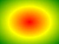
CSS3 Radial Gradients
A radial gradient is defined by its center.To create a radial gradient you must also define at least two color stops.
Example of Radial Gradient:
Syntax
background: radial-gradient(shape size at position, start-color, ..., last-color);
Radial Gradient - Evenly Spaced Color Stops (this is default)
Example
A radial gradient with evenly spaced color stops:
#grad {
background: -webkit-radial-gradient(red, green, blue); /* Safari 5.1 to 6.0 */
background: -o-radial-gradient(red, green, blue); /* For Opera 11.6 to 12.0 */
background: -moz-radial-gradient(red, green, blue); /* For Firefox 3.6 to 15 */
background: radial-gradient(red, green, blue); /* Standard syntax */
}
Example
A radial gradient with differently spaced color stops:
#grad {
background: -webkit-radial-gradient(red 5%, green 15%, blue 60%); /* Safari 5.1-6.0 */
background: -o-radial-gradient(red 5%, green 15%, blue 60%); /* For Opera 11.6-12.0 */
background: -moz-radial-gradient(red 5%, green 15%, blue 60%); /* For Firefox 3.6-15 */
background: radial-gradient(red 5%, green 15%, blue 60%); /* Standard syntax */
}
Set Shape
The shape parameter defines the shape. It can take the value circle or ellipse. The default value is ellipse.Example
A radial gradient with the shape of a circle:
#grad {
background: -webkit-radial-gradient(circle, red, yellow, green); /* Safari */
background: -o-radial-gradient(circle, red, yellow, green); /* Opera 11.6 to 12.0 */
background: -moz-radial-gradient(circle, red, yellow, green); /* Firefox 3.6 to 15 */
background: radial-gradient(circle, red, yellow, green); /* Standard syntax */
}
Use of Different Size Keywords
The size parameter defines the size of the gradient. It can take four values:- closest-side
- farthest-side
- closest-corner
- farthest-corner
Example
A radial gradient with different size keywords:
#grad1 {
/* Safari 5.1 to 6.0 */
background: -webkit-radial-gradient(60% 55%, closest-side,blue,green,yellow,black);
/* For Opera 11.6 to 12.0 */
background: -o-radial-gradient(60% 55%, closest-side,blue,green,yellow,black);
/* For Firefox 3.6 to 15 */
background: -moz-radial-gradient(60% 55%, closest-side,blue,green,yellow,black);
/* Standard syntax */
background: radial-gradient(closest-side at 60% 55%,blue,green,yellow,black);
}
#grad2 {
/* Safari 5.1 to 6.0 */
background: -webkit-radial-gradient(60% 55%, farthest-side,blue,green,yellow,black);
/* Opera 11.6 to 12.0 */
background: -o-radial-gradient(60% 55%, farthest-side,blue,green,yellow,black);
/* For Firefox 3.6 to 15 */
background: -moz-radial-gradient(60% 55%, farthest-side,blue,green,yellow,black);
/* Standard syntax */
background: radial-gradient(farthest-side at 60% 55%,blue,green,yellow,black);
}
/* Safari 5.1 to 6.0 */
background: -webkit-radial-gradient(60% 55%, closest-side,blue,green,yellow,black);
/* For Opera 11.6 to 12.0 */
background: -o-radial-gradient(60% 55%, closest-side,blue,green,yellow,black);
/* For Firefox 3.6 to 15 */
background: -moz-radial-gradient(60% 55%, closest-side,blue,green,yellow,black);
/* Standard syntax */
background: radial-gradient(closest-side at 60% 55%,blue,green,yellow,black);
}
#grad2 {
/* Safari 5.1 to 6.0 */
background: -webkit-radial-gradient(60% 55%, farthest-side,blue,green,yellow,black);
/* Opera 11.6 to 12.0 */
background: -o-radial-gradient(60% 55%, farthest-side,blue,green,yellow,black);
/* For Firefox 3.6 to 15 */
background: -moz-radial-gradient(60% 55%, farthest-side,blue,green,yellow,black);
/* Standard syntax */
background: radial-gradient(farthest-side at 60% 55%,blue,green,yellow,black);
}
Repeating a radial-gradient
The repeating-radial-gradient() function is used to repeat radial gradients:Example
A repeating radial gradient:
#grad {
/* For Safari 5.1 to 6.0 */
background: -webkit-repeating-radial-gradient(red, yellow 10%, green 15%);
/* For Opera 11.6 to 12.0 */
background: -o-repeating-radial-gradient(red, yellow 10%, green 15%);
/* For Firefox 3.6 to 15 */
background: -moz-repeating-radial-gradient(red, yellow 10%, green 15%);
/* Standard syntax */
background: repeating-radial-gradient(red, yellow 10%, green 15%);
}
CSS3 Text Effects
CSS3 Text Effects
CSS3 contains several new text features.In this chapter you will learn about the following text properties:
- text-shadow
- word-wrap
Browser Support
The numbers in the table specify the first browser version that fully supports the property.| Property | |||||
|---|---|---|---|---|---|
| text-shadow | 10.0 | 4.0 | 3.5 | 4.0 | 9.5 |
| word-wrap | 5.5 | 23.0 | 3.5 | 6.1 | 12.1 |
CSS3 Text Shadow
In CSS3, the text-shadow property applies shadow to text.
You specify the horizontal shadow, the vertical shadow, the blur distance, and the color of the shadow:
Example
Add a shadow to a <h1> element:
h1
{
text-shadow: 5px 5px 5px #FF0000;
}
text-shadow: 5px 5px 5px #FF0000;
}
CSS3 Word Wrapping
If a word is too long to fit within an area, it expands outside:
This paragraph contains a very long word:
thisisaveryveryveryveryveryverylongword. The long word will break and
wrap to the next line.
In CSS3, the word-wrap property allows you to force the text to wrap - even if it means splitting it in the middle of a word:
This paragraph contains a very long word:
thisisaveryveryveryveryveryverylongword. The long word will break and
wrap to the next line.
The CSS code is as follows:Example
Allow long words to be able to break and wrap onto the next line:
p {
word-wrap: break-word;
}
word-wrap: break-word;
}
CSS3 Web Fonts

CSS3 Web Fonts - The @font-face Rule
Web fonts allow Web designers to use fonts that are not installed on the user's computer.When you have found/bought the font you wish to use, just include the font file on your web server, and it will be automatically downloaded to the user when needed.
Your "own" fonts are defined within the CSS3 @font-face rule.
Browser Support
The numbers in the table specify the first browser version that fully supports the property.| Property | |||||
|---|---|---|---|---|---|
| @font-face | 9.0 | 4.0 | 3.5 | 3.2 | 10.0 |
Different Font Formats
TrueType Fonts (TTF)TrueType is a font standard developed in the late 1980s, by Apple and Microsoft. TrueType is the most common font format for both the Mac OS and Microsoft Windows operating systems.
OpenType Fonts (OTF)
OpenType is a format for scalable computer fonts. It was built on TrueType, and is a registered trademark of Microsoft. OpenType fonts are used commonly today on the major computer platforms.
The Web Open Font Format (WOFF)
WOFF is a font format for use in web pages. It was developed in 2009, and is now a W3C Recommendation. WOFF is essentially OpenType or TrueType with compression and additional metadata. The goal is to support font distribution from a server to a client over a network with bandwidth constraints.
The Web Open Font Format (WOFF 2.0)
TrueType/OpenType font that provides better compression than WOFF 1.0.
SVG Fonts/Shapes
SVG fonts allow SVG to be used as glyphs when displaying text. The SVG 1.1 specification define a font module that allows the creation of fonts within an SVG document. You can also apply CSS to SVG documents, and the @font-face rule can be applied to text in SVG documents.
Embedded OpenType Fonts (EOT)
EOT fonts are a compact form of OpenType fonts designed by Microsoft for use as embedded fonts on web pages.
Browser Support for Font Formats
The numbers in the table specifies the first browser version that fully supports the font format.| Font format | |||||
|---|---|---|---|---|---|
| TTF/OTF | 9.0* | 4.0 | 3.5 | 3.1 | 10.0 |
| WOFF | 9.0 | 5.0 | 3.6 | 5.1 | 11.1 |
| WOFF2 | Not supported | 36.0 | 35.0* | Not supported | 26.0 |
| SVG | Not supported | 4.0 | Not supported | 3.2 | 9.0 |
| EOT | 6.0 | Not supported | Not supported | Not supported | Not supported |
*Firefox: Not supported by default, but can be enabled (need to set a flag to "true" to use WOFF2).
Using The Font You Want
In the CSS3 @font-face rule you must first define a name for the font (e.g. myFirstFont), and then point to the font file. |
Tip: Always use lowercase letters for the font URL. Uppercase letters can give unexpected results in IE. |
|---|
Example
@font-face
{
font-family: myFirstFont;
src: url(sansation_light.woff);
}
div {
font-family: myFirstFont;
}
font-family: myFirstFont;
src: url(sansation_light.woff);
}
div {
font-family: myFirstFont;
}
Using Bold Text
You must add another @font-face rule containing descriptors for bold text:Example
@font-face
{
font-family: myFirstFont;
src: url(sansation_bold.woff);
font-weight: bold;
}
font-family: myFirstFont;
src: url(sansation_bold.woff);
font-weight: bold;
}
Browsers will use this whenever a piece of text with the font-family "myFirstFont" should render as bold.
This way you can have many @font-face rules for the same font.
CSS3 Font Descriptors
The following table lists all the font descriptors that can be defined inside the @font-face rule:| Descriptor | Values | Description |
|---|---|---|
| font-family | name | Required. Defines a name for the font |
| src | URL | Required. Defines the URL of the font file |
| font-stretch | normal condensed ultra-condensed extra-condensed semi-condensed expanded semi-expanded extra-expanded ultra-expanded |
Optional. Defines how the font should be stretched. Default is "normal" |
| font-style | normal italic oblique |
Optional. Defines how the font should be styled. Default is "normal" |
| font-weight | normal bold 100 200 300 400 500 600 700 800 900 |
Optional. Defines the boldness of the font. Default is "normal" |
| unicode-range | unicode-range | Optional. Defines the range of UNICODE characters the font supports. Default is "U+0-10FFFF" |
CSS3 2D Transforms
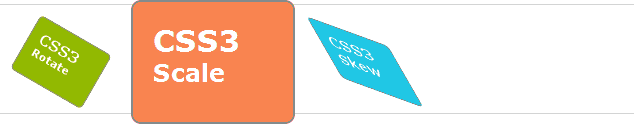
CSS3 Transforms
CSS3 transforms allow you to translate, rotate, scale, and skew elements.A transformation is an effect that lets an element change shape, size and position.
CSS3 supports 2D and 3D transformations.
Browser Support for 2D Transforms
The numbers in the table specify the first browser version that fully supports the property.Numbers followed by -ms-, -webkit-, -moz-, or -o- specify the first version that worked with a prefix.
| Property | |||||
|---|---|---|---|---|---|
| transform | 10.0 9.0 -ms- |
36.0 4.0 -webkit- |
16.0 3.5 -moz- |
3.2 -webkit- | 23.0 15.0 -webkit- 12.1 10.5 -o- |
| transform-origin (two-value syntax) |
10.0 9.0 -ms- |
36.0 4.0 -webkit- |
16.0 3.5 -moz- |
3.2 -webkit- | 23.0 15.0 -webkit- 12.1 10.5 -o- |
CSS3 2D Transforms
In this chapter you will learn about the following 2D transformation methods:- translate()
- rotate()
- scale()
- skewX()
- skewY()
- matrix()
|
Tip: You will learn about 3D transformations in the next chapter. |
|---|
The translate() Method
 The translate() method moves an element from its current position (according
to the parameters given for the X-axis and the Y-axis).
The translate() method moves an element from its current position (according
to the parameters given for the X-axis and the Y-axis).The following example moves the <div> element 50 pixels to the right, and 100 pixels down from its current position:
Example
div
{
-ms-transform: translate(50px,100px); /* IE 9 */
-webkit-transform: translate(50px,100px); /* Safari */
transform: translate(50px,100px);
}
-ms-transform: translate(50px,100px); /* IE 9 */
-webkit-transform: translate(50px,100px); /* Safari */
transform: translate(50px,100px);
}
The rotate() Method
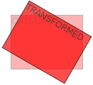 The rotate() method rotates an element clockwise or counter-clockwise according to a given degree.
The following example rotates the <div> element clockwise with 20 degrees:
Example
div
{
-ms-transform: rotate(20deg); /* IE 9 */
-webkit-transform: rotate(20deg); /* Safari */
transform: rotate(20deg);
}
-ms-transform: rotate(20deg); /* IE 9 */
-webkit-transform: rotate(20deg); /* Safari */
transform: rotate(20deg);
}
The following example rotates the <div> element counter-clockwise with 20 degrees:
Example
div
{
-ms-transform: rotate(-20deg); /* IE 9 */
-webkit-transform: rotate(-20deg); /* Safari */
transform: rotate(-20deg);
}
-ms-transform: rotate(-20deg); /* IE 9 */
-webkit-transform: rotate(-20deg); /* Safari */
transform: rotate(-20deg);
}
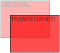
The scale() Method
 The scale() method increases or decreases the size of an element (according to the parameters given for the width and height).
The following example increases the <div> element to be two times of its original width, and three times of its original height:
Example
div
{
-ms-transform: scale(2,3); /* IE 9 */
-webkit-transform: scale(2,3); /* Safari */
transform: scale(2,3);
}
-ms-transform: scale(2,3); /* IE 9 */
-webkit-transform: scale(2,3); /* Safari */
transform: scale(2,3);
}
Example
div
{
-ms-transform: scale(0.5,0.5); /* IE 9 */
-webkit-transform: scale(0.5,0.5); /* Safari */
transform: scale(0.5,0.5);
}
-ms-transform: scale(0.5,0.5); /* IE 9 */
-webkit-transform: scale(0.5,0.5); /* Safari */
transform: scale(0.5,0.5);
}
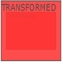
The skewX() Method
The skewX() method skews an element along the X-axis by the given angle.The following example skews the <div> element 20 degrees along the X-axis:
Example
div
{
-ms-transform: skewX(20deg); /* IE 9 */
-webkit-transform: skewX(20deg); /* Safari */
transform: skewX(20deg);
}
-ms-transform: skewX(20deg); /* IE 9 */
-webkit-transform: skewX(20deg); /* Safari */
transform: skewX(20deg);
}
The skewY() Method
The skewY() method skews an element along the Y-axis by the given angle.The following example skews the <div> element 20 degrees along the Y-axis:
Example
div
{
-ms-transform: skewY(20deg); /* IE 9 */
-webkit-transform: skewY(20deg); /* Safari */
transform: skewY(20deg);
}
-ms-transform: skewY(20deg); /* IE 9 */
-webkit-transform: skewY(20deg); /* Safari */
transform: skewY(20deg);
}
The matrix() Method
The matrix() method combines all of the 2D transform methods into one.The matrix method take six parameters, containing mathematic functions, which allows you to: rotate, scale, move (translate), and skew elements.
Example
How to rotate a div element 30 degrees, using the matrix method:
div
{
-ms-transform: matrix(0.866,0.5,-0.5,0.866,0,0); /* IE 9 */
-webkit-transform: matrix(0.866,0.5,-0.5,0.866,0,0); /* Safari */
transform: matrix(0.866,0.5,-0.5,0.866,0,0);
}
-ms-transform: matrix(0.866,0.5,-0.5,0.866,0,0); /* IE 9 */
-webkit-transform: matrix(0.866,0.5,-0.5,0.866,0,0); /* Safari */
transform: matrix(0.866,0.5,-0.5,0.866,0,0);
}
CSS3 Transform Properties
The following table lists all the transform properties:| Property | Description |
|---|---|
| transform | Applies a 2D or 3D transformation to an element |
| transform-origin | Allows you to change the position on transformed elements |
2D Transform Methods
| Function | Description |
|---|---|
| matrix(n,n,n,n,n,n) | Defines a 2D transformation, using a matrix of six values |
| translate(x,y) | Defines a 2D translation, moving the element along the X- and the Y-axis |
| translateX(n) | Defines a 2D translation, moving the element along the X-axis |
| translateY(n) | Defines a 2D translation, moving the element along the Y-axis |
| scale(x,y) | Defines a 2D scale transformation, changing the elements width and height |
| scaleX(n) | Defines a 2D scale transformation, changing the element's width |
| scaleY(n) | Defines a 2D scale transformation, changing the element's height |
| rotate(angle) | Defines a 2D rotation, the angle is specified in the parameter |
| skew(x-angle,y-angle) | Defines a 2D skew transformation along the X- and the Y-axis |
| skewX(angle) | Defines a 2D skew transformation along the X-axis |
| skewY(angle) | Defines a 2D skew transformation along the Y-axis |
CSS3 3D Transforms
CSS3 3D Transforms
CSS3 allows you to format your elements using 3D transforms.In this chapter you will learn about some of the 3D transform methods:
- rotateX()
- rotateY()
Click on the elements below, to see the difference between a 2D transform and a 3D transform:
2D rotate
3D rotate
Browser Support for 3D Transforms
The numbers in the table specify the first browser version that fully supports the property.Numbers followed by -webkit-, -moz-, or -o- specify the first version that worked with a prefix.
| Property | |||||
|---|---|---|---|---|---|
| transform | 10.0 | 36.0 12.0 -webkit- |
16.0 10.0 -moz- |
4.0 -webkit- | 23.0 15.0 -webkit- |
| transform-origin (three-value syntax) |
10.0 | 36.0 12.0 -webkit- |
16.0 10.0 -moz- |
4.0 -webkit- | 23.0 15.0 -webkit- |
| transform-style | 11.0 | 36.0 12.0 -webkit- |
16.0 10.0 -moz- |
4.0 -webkit- | 23.0 15.0 -webkit- |
| perspective | 10.0 | 36.0 12.0 -webkit- |
16.0 10.0 -moz- |
4.0 -webkit- | 23.0 15.0 -webkit- |
| perspective-origin | 10.0 | 36.0 12.0 -webkit- |
16.0 10.0 -moz- |
4.0 -webkit- | 23.0 15.0 -webkit- |
| backface-visibility | 10.0 | 36.0 12.0 -webkit- |
16.0 10.0 -moz- |
4.0 -webkit- | 23.0 15.0 -webkit- |
The rotateX() Method
 With the rotateX() method, the element rotates around its X-axis at a given degree.
Example
div
{
-webkit-transform: rotateX(120deg); /* Chrome, Safari, Opera */
transform: rotateX(120deg);
}
-webkit-transform: rotateX(120deg); /* Chrome, Safari, Opera */
transform: rotateX(120deg);
}
The rotateY() Method
 With the rotateY() method, the element rotates around its Y-axis at a given degree.
Example
div
{
-webkit-transform: rotateY(130deg); /* Chrome, Safari, Opera */
transform: rotateY(130deg);
}
-webkit-transform: rotateY(130deg); /* Chrome, Safari, Opera */
transform: rotateY(130deg);
}
CSS3 Transform Properties
The following table lists all the transform properties:| Property | Description |
|---|---|
| transform | Applies a 2D or 3D transformation to an element |
| transform-origin | Allows you to change the position on transformed elements |
| transform-style | Specifies how nested elements are rendered in 3D space |
| perspective | Specifies the perspective on how 3D elements are viewed |
| perspective-origin | Specifies the bottom position of 3D elements |
| backface-visibility | Defines whether or not an element should be visible when not facing the screen |
3D Transform Methods
| Function | Description |
|---|---|
| matrix3d (n,n,n,n,n,n,n,n,n,n,n,n,n,n,n,n) |
Defines a 3D transformation, using a 4x4 matrix of 16 values |
| translate3d(x,y,z) | Defines a 3D translation |
| translateX(x) | Defines a 3D translation, using only the value for the X-axis |
| translateY(y) | Defines a 3D translation, using only the value for the Y-axis |
| translateZ(z) | Defines a 3D translation, using only the value for the Z-axis |
| scale3d(x,y,z) | Defines a 3D scale transformation |
| scaleX(x) | Defines a 3D scale transformation by giving a value for the X-axis |
| scaleY(y) | Defines a 3D scale transformation by giving a value for the Y-axis |
| scaleZ(z) | Defines a 3D scale transformation by giving a value for the Z-axis |
| rotate3d(x,y,z,angle) | Defines a 3D rotation |
| rotateX(angle) | Defines a 3D rotation along the X-axis |
| rotateY(angle) | Defines a 3D rotation along the Y-axis |
| rotateZ(angle) | Defines a 3D rotation along the Z-axis |
| perspective(n) | Defines a perspective view for a 3D transformed element |
CSS3 Transitions
CSS3 Transitions
With CSS3, we can add an effect when changing from one style to another, without using Flash or JavaScript.Mouse over the element below:
CSS3
Transition
Transition
Browser Support
The numbers in the table specify the first browser version that fully supports the property.Numbers followed by -webkit-, -moz-, or -o- specify the first version that worked with a prefix.
| Property | |||||
|---|---|---|---|---|---|
| transition | 10.0 | 26.0 4.0 -webkit- |
16.0 4.0 -moz- |
6.1 3.1 -webkit- |
12.1 10.5 -o- |
| transition-delay | 10.0 | 26.0 4.0 -webkit- |
16.0 4.0 -moz- |
6.1 3.1 -webkit- |
12.1 10.5 -o- |
| transition-duration | 10.0 | 26.0 4.0 -webkit- |
16.0 4.0 -moz- |
6.1 3.1 -webkit- |
12.1 10.5 -o- |
| transition-property | 10.0 | 26.0 4.0 -webkit- |
16.0 4.0 -moz- |
6.1 3.1 -webkit- |
12.1 10.5 -o- |
| transition-timing-function | 10.0 | 26.0 4.0 -webkit- |
16.0 4.0 -moz- |
6.1 3.1 -webkit- |
12.1 10.5 -o- |
What Are CSS3 Transitions?
CSS3 transitions are effects that let an element gradually change from one style to another.To do this, you must specify two things:
- the CSS property you want to add an effect to
- the duration of the effect
Example
Add a transition effect on the width property, with a duration
of 2 seconds:
div
{
-webkit-transition: width 2s; /* For Safari 3.1 to 6.0 */
transition: width 2s;
}
-webkit-transition: width 2s; /* For Safari 3.1 to 6.0 */
transition: width 2s;
}
The transition effect will start when the specified CSS property changes value. A typical CSS property change would be when a user mouse-over an element:
Example
Specify :hover for <div> elements:
div:hover
{
width: 300px;
}
width: 300px;
}
Multiple Changes
To add transition effects for more than one CSS property, separate the properties with a comma:Example
Add transition effects on width, height, and transformation:
div
{
-webkit-transition: width 2s, height 2s,-webkit-transform 2s; /* For Safari 3.1 to 6.0 */
transition: width 2s, height 2s, transform 2s;
}
-webkit-transition: width 2s, height 2s,-webkit-transform 2s; /* For Safari 3.1 to 6.0 */
transition: width 2s, height 2s, transform 2s;
}
More Transition Examples
The example below uses all the four transition properties:Example
div
{
/* For Safari 3.1 to 6.0 */
-webkit-transition-property: width;
-webkit-transition-duration: 1s;
-webkit-transition-timing-function: linear;
-webkit-transition-delay: 2s;
/* Standard syntax */
transition-property: width;
transition-duration: 1s;
transition-timing-function: linear;
transition-delay: 2s;
}
Example
div
{
-webkit-transition: width 1s linear 2s; /* For Safari 3.1 to 6.0 */
transition: width 1s linear 2s;
}
-webkit-transition: width 1s linear 2s; /* For Safari 3.1 to 6.0 */
transition: width 1s linear 2s;
}
CSS3 Transition Properties
The following table lists all the transition properties:| Property | Description | CSS |
|---|---|---|
| transition | A shorthand property for setting the four transition properties into a single property | 3 |
| transition-delay | Specifies when the transition effect will start | 3 |
| transition-duration | Specifies how many seconds or milliseconds a transition effect takes to complete | 3 |
| transition-property | Specifies the name of the CSS property the transition effect is for | 3 |
| transition-timing-function | Specifies the speed curve of the transition effect | 3 |